Project Overview
Our design agency is working with a regional telecommunications company that offers services to the population in the telecom sector.
Task
Our goal was to create a logo and style that will distinguish this young company from competitors.
Briefing
During the briefing, it was discovered that the client prefers familiar symbols such as antennas and radio waves. However, he also wants to convey the company's solidity and its unique approach to work.

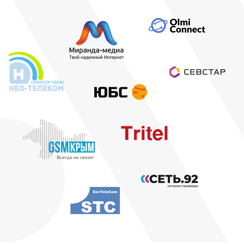
We conducted a thorough analysis of the competitors' visuals to identify common design choices that should be avoided in our final design.
Analysis

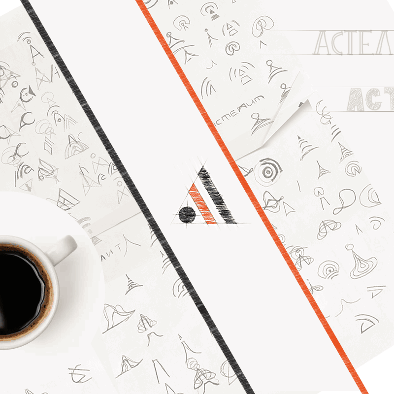
We explored various concepts and eventually settled on the synthesis of the letter "A" and radio waves as the core metaphor. The letter "A" itself resembles an antenna and forms a stable triangle, which aligns perfectly with the client's desire for solidity.
Research
The letter "A" stylized as a signal distribution point, evoking a sense of familiarity with Wi-Fi.

01

Incorporating a radio tower emitting signals enclosed within a circle to symbolize stability.
02
The letter "A" as an antenna in the form of a signal. For visual stability, the symbol is inscribed in a triangle.

03
We presented the client with three logo variations that meet their requirements. The logos were initially presented in a neutral black and white version. The client was impressed with Option 1 and considered it to be the perfect representation of their vision.
Matching
Advantages of the Symbol:
1. The logo features a recognizable and memorable metaphor.
2. Its simple design allows for easy artistic implementation.
3. The logo scales well across various applications.
4. The symbol's integration within a triangle adds stability and visual appeal.
Font Choosing
The chosen fonts were meticulously paired to maintain consistency with the block lettering style of the logo.
Color Selection
We carefully selected a color palette that not only complements the industry but also differentiates the company from its direct competitors.
Presents
With all the logo components approved, we proceeded to create comprehensive guidelines for logo usage and brand representation, providing examples of real-life applications.
Epilogue
The telecommunications industry now boasts a bright and worthy competitor, equipped with a unique visual language. As a design agency, we take pride in our contribution to their journey and their potential in achieving their set goals.


